19 products found
Products
Featured
Views
Creators
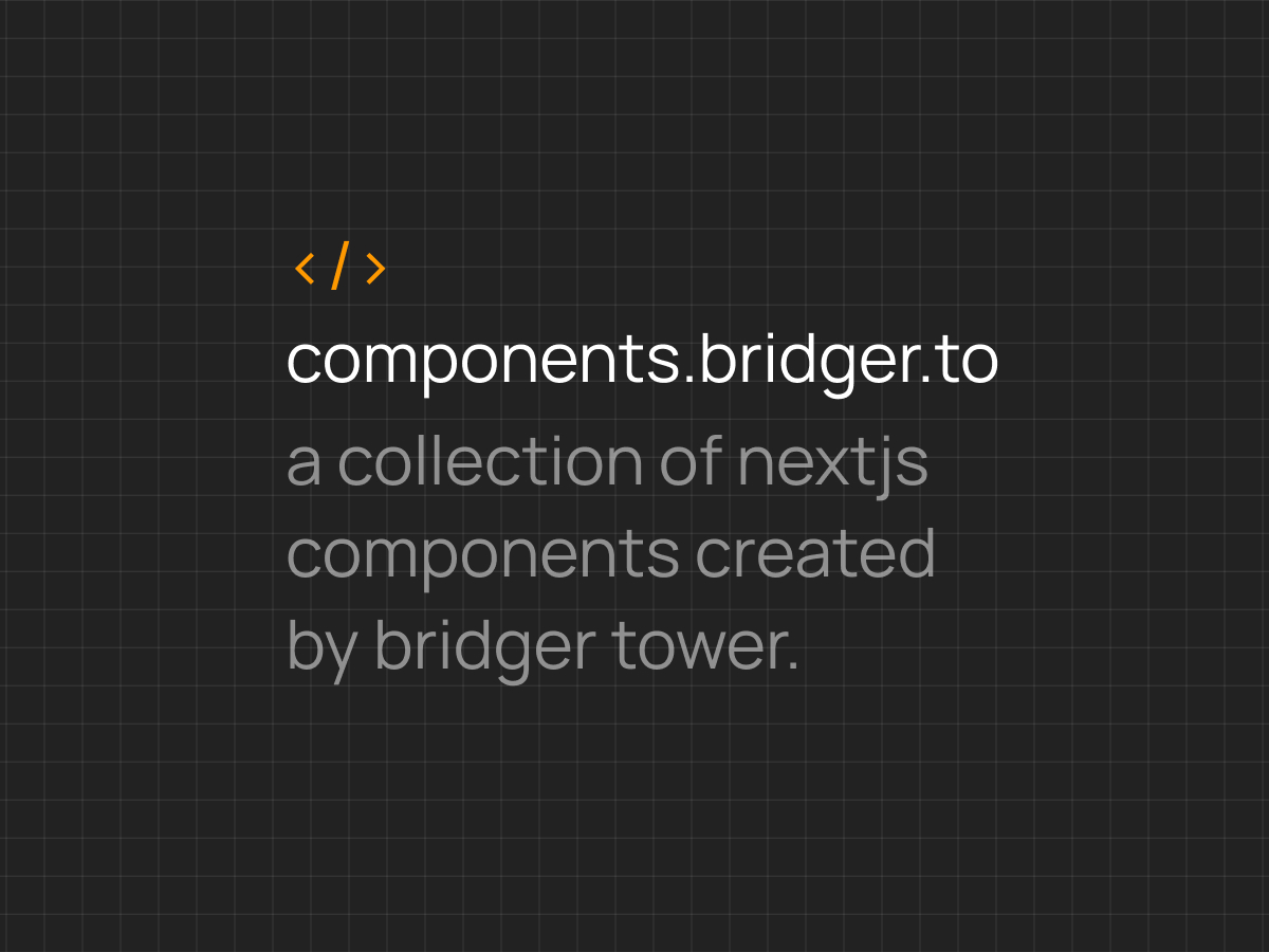
components.bridger.to
nextjs_components
next_js_components
shadcn-extension.verce...
carousel
pro.cult-ui.com
shadcn_blocks
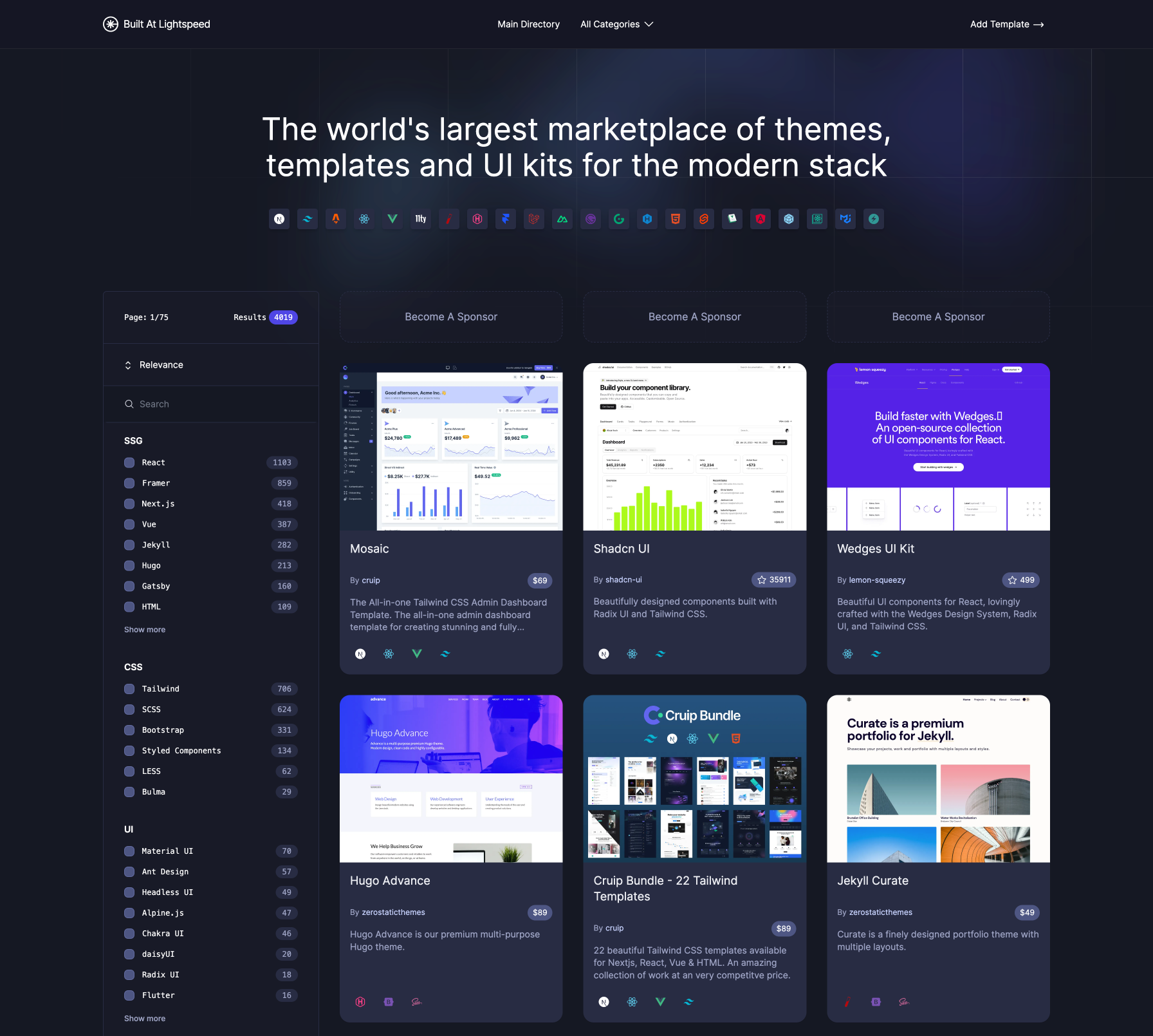
builtatlightspeed.com
jamstack_themes
css-tricks.com/firebas...
firebase_react_auth
vercel.com/blog/buildi...
next_image_gallery
A curated collection of TypeScript React components for Next.js, built with Tailwind and shadcn/ui, created by Bridger Tower. Enables rapid assembly of modern, responsive websites using reusable UI blocks.
0
component_libraries
A TypeScript React component library for Next.js, built with Tailwind and shadcn/ui, created by Bridger Tower. It provides reusable UI building blocks to accelerate development and ensure a consistent look across projects.
6
A ready-to-use carousel component that supports all Embla Carousel features, with API reference, accessibility, and keyboard navigation for smooth, accessible carousels.
4
Premium Shadcn Blocks collection featuring full-stack components, animated UI elements, and ready-to-use templates. Built with Next.js 15, Tailwind CSS, and Supabase to help you ship SaaS apps faster.
2
A directory and marketplace of open-source and premium Jamstack themes, templates, starters, and UI kits for rapid modern web development, featuring Shadcn blocks and Next.js boilerplates.
frontend_frameworks
A practical tutorial on adding Google-based authentication with Firebase to a React app, covering sign-in/out, session persistence, and UI updates to show the user and restrict actions to authenticated users.
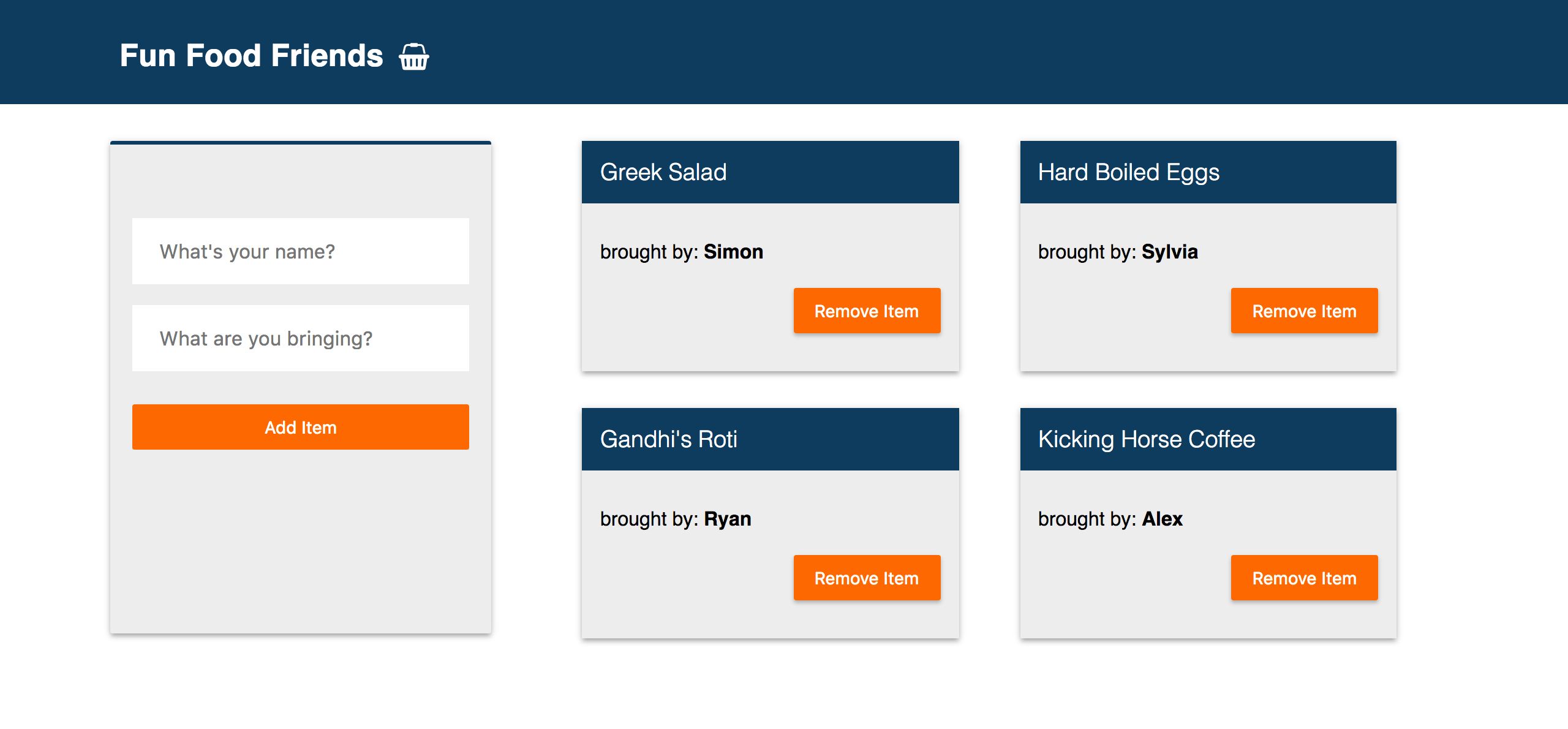
A practical guide to building a high-performance, animated image gallery using Next.js' Image component and Cloudinary. Learn to render hundreds of large images with smooth UX, accessibility, and efficient loading.
A practical guide for deploying a Create React App to GitHub Pages using the gh-pages package. Includes setup steps, package.json scripts, and hosting configuration.
A React-based coverflow carousel built with Tailwind and Framer Motion. Delivers smooth, customizable transitions for modern web interfaces.
Official repository for Vue 2, including code history and issues. Vue 2 has reached End of Life; for Vue 3, see the vuejs/core repository.
A lightweight, customizable Vue UI library for mobile web apps, offering modular components and easy theming to accelerate development and ensure performance.
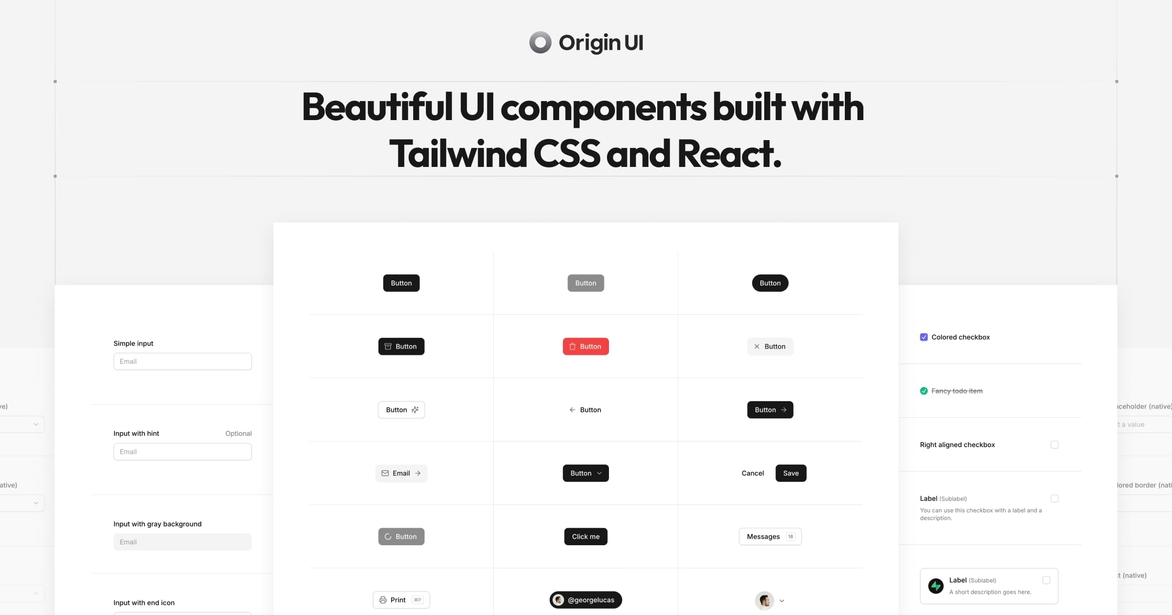
A free, open-source library of copy-and-paste UI components built with Tailwind CSS and React, designed for rapid app UI assembly. Includes Navbar, Accordion, Dialog, Button, Tabs, and more—ready to drop into your project.
22
A curated collection of customized Shadcn UI blocks and components with live previews and copy-ready code snippets, designed to accelerate web development.
8
A premium component library offering hundreds of extra Shadcn UI blocks and components built with Shadcn UI, React, and Tailwind, designed to accelerate development with unlimited usage and ongoing updates. Includes categorized blocks, templates, and ready-to-use UI kits for rapid integration.
10
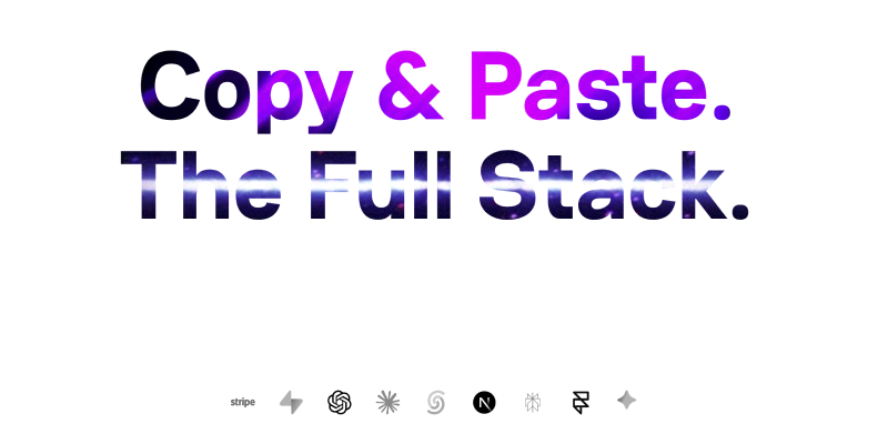
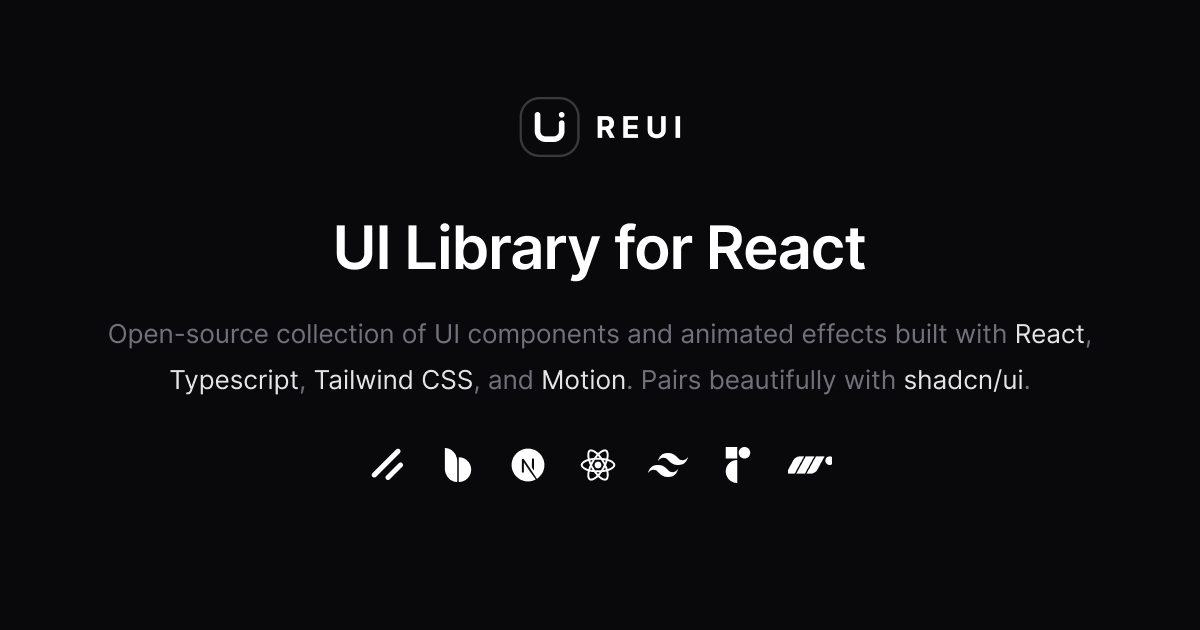
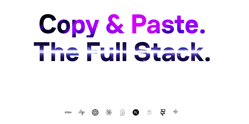
A free, open-source collection of 100+ UI components for modern web apps, built with Next.js, React, Tailwind CSS, and Motion to accelerate development.
An open-source UI component library for React with TypeScript, Tailwind CSS, and Motion, featuring animated components and seamless integration with shadcn/ui.
12
A collection of neobrutalism-styled components based on shadcn/ui. It provides ready-to-use UI elements to assemble modern, bold interfaces with ease.
A registry of composable, accessible, open-source React components designed for seamless use with shadcn/ui. Built with React, TypeScript, Tailwind CSS, Lucide, and Radix UI to speed up interface development.
Open-source Shadcn UI components, animated blocks, and full templates you can copy-paste into any TypeScript/Next.js project. Tailwind, Framer, and React integration included.